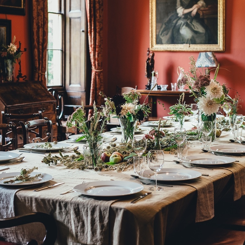
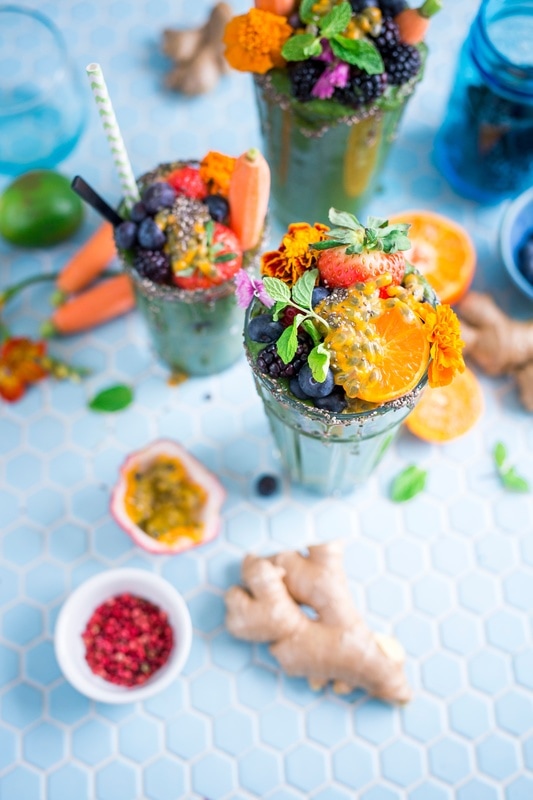
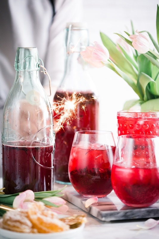
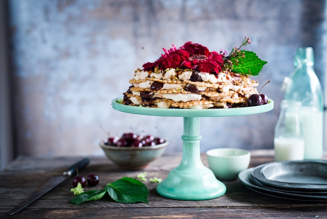
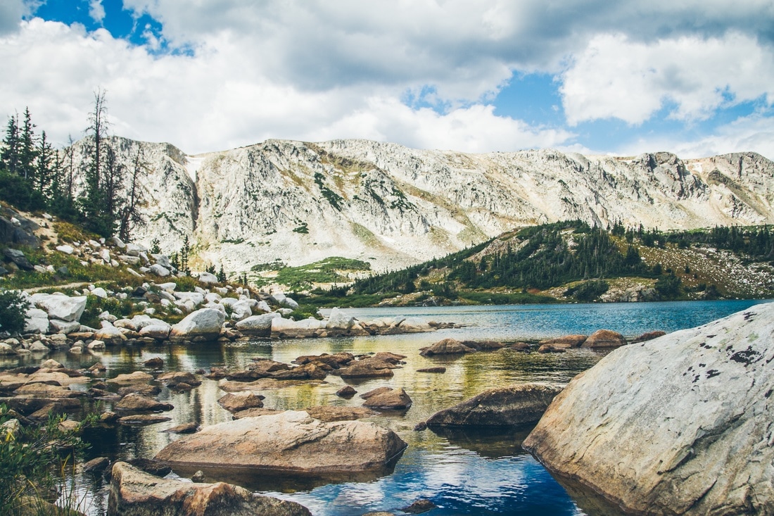
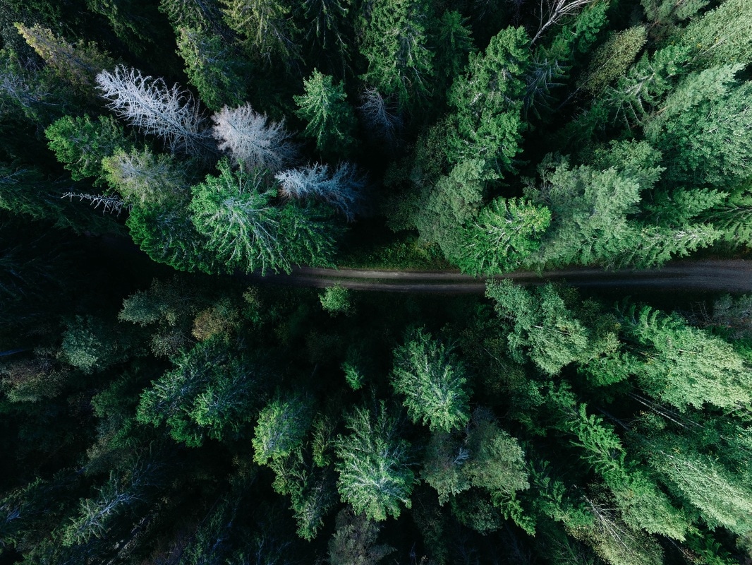
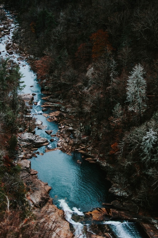
 Well it’s been a week since I started working on my brand photography activity, and so I’m down to 20 photos. Let’s take a closer look! 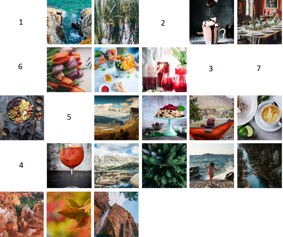 Food and Drink Nature Near and Far Personal Touch So, now that I have these twenty - that's still not enough for a full library. But, it will be much easier to select new photos to add to my library. Instead of having to always consider each specific brand photography aspect (subject, concept, mood), I can easily add the photo to this set, and quickly see if it looks out of place. So much easier!
0 Comments
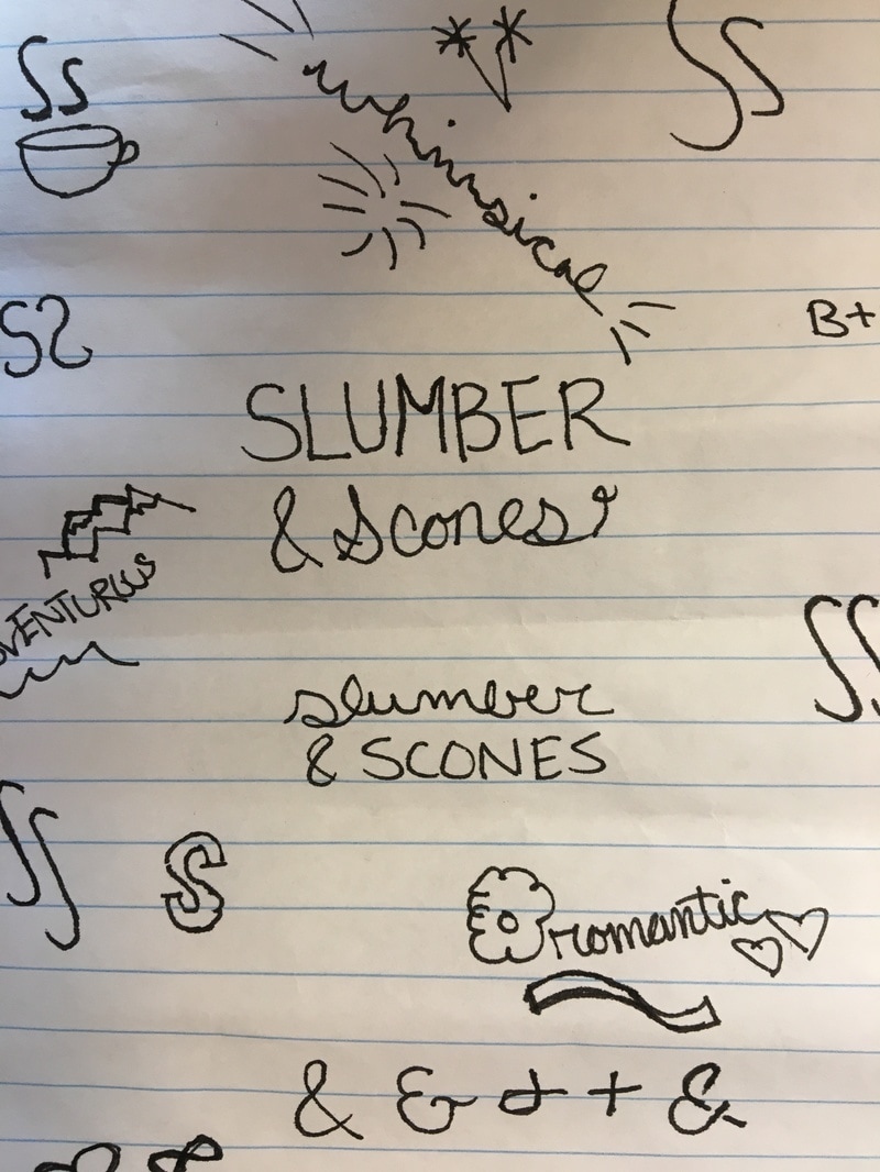
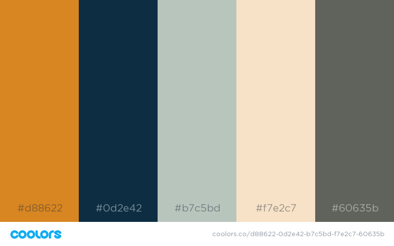
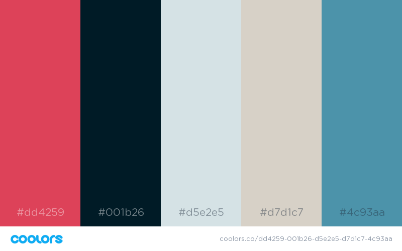
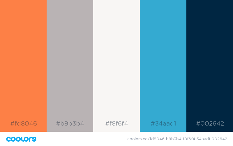
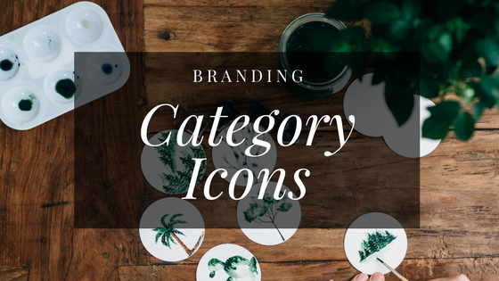 One thing I’m thinking of including on the blog is category icons. I love how these look on other blogs, and it can be a great visual cue as to what a post is about, and where it fits in the larger sense of the blog. The problem here is that I have approximately 50 gajillion categories! I suppose I could try to combine them a little better: like maybe travel and nature could be together, or relaxation and hospitality. Here’s a few sketches for idea. Maybe you’ll see them on blog! 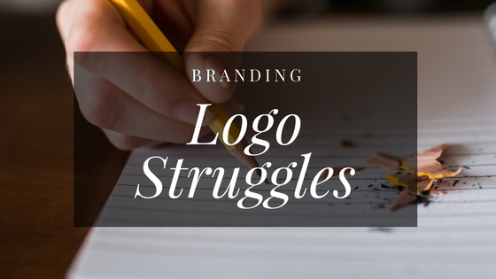 This is going to be my biggest struggle isn’t it? I keep going back to that coffee cup with the S’s for steam. Is that too generic though? Coffee is comforting and warm and welcoming, but does it show whimsy and adventure? Ugh. I also was working on some other ideas, a few monogram inspired, some that focus on the ampersand, and a couple of keys - which I like but don’t love. At some point, I should probably be narrowing down, not trying to come up with more ideas - but here’s one more for now: What if I don’t have a symbolic logo, just a wordmark? I guess I should start looking into fonts! (Also, I keep coming back to that coffee cup with the S's as steam. Maybe I rejected it too quickly...) 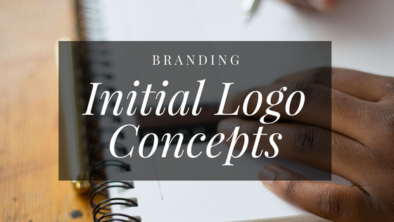 Today I’m thinking about a specific different aspect of my visual identity: a logo. Now, I don’t really like logos. To me, they are these little symbols that are trying to brainwash us. The purpose of a logo is to stick in your mind. It’s to make you constantly think of a single company. It’s a little icky. But it seems it’s a necessary evil. The logo for Slumber and Scones can be a little less rigid than say, a corporation, however. I’ll probably use it as a blog header and a mark on Pinterest posts. But I still want to incorporate my brand concepts into it, and wrap the whole thing up into a perfect little bow. At first I started thinking about a logo that was strictly b&b themed: food. I began with a coffee cup, two S’s steaming out of it. It was adorable, but not exactly adventurous, whimsical, and romantic - so back to the drawing board, literally. I sketched some concepts, writing out the words and the initials, drawing fancy ampersands, creating little doodles and pictorial representations of the words. Whimsy was a firework, romance a leaf, adventure an ocean. It grew from there: an entire page of silly little icons and images, intertwined with monograms. I kind of hoped something on the page would just leap out at me. Apparently, that’s not entirely how it works. So the logo is still in-progress, and that’s okay. Something will come of it soon, I hope. 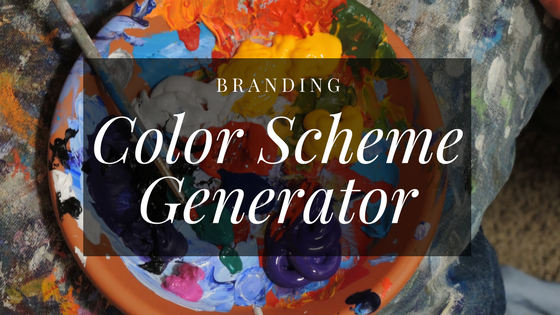 Now that I have my photography style nailed down, and I’ve found some color scheme inspiration, I thought it was a good time to come up with some unique color schemes using a generator and a few of the photos I grabbed. One of these might become the Slumber & Scones palette! Here’s a few I created: 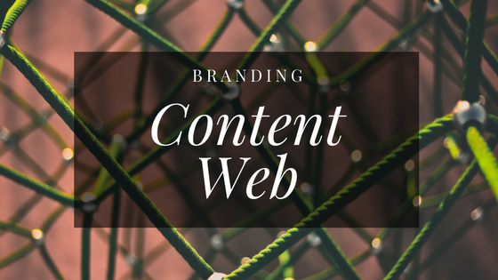 Let’s back away from visual brand for a bit. Today I want to talk about blog content. The whole point of a blog is the posts. What it looks like can draw someone in, but without solid content, readers won’t stick around, and they certainly won’t come back.
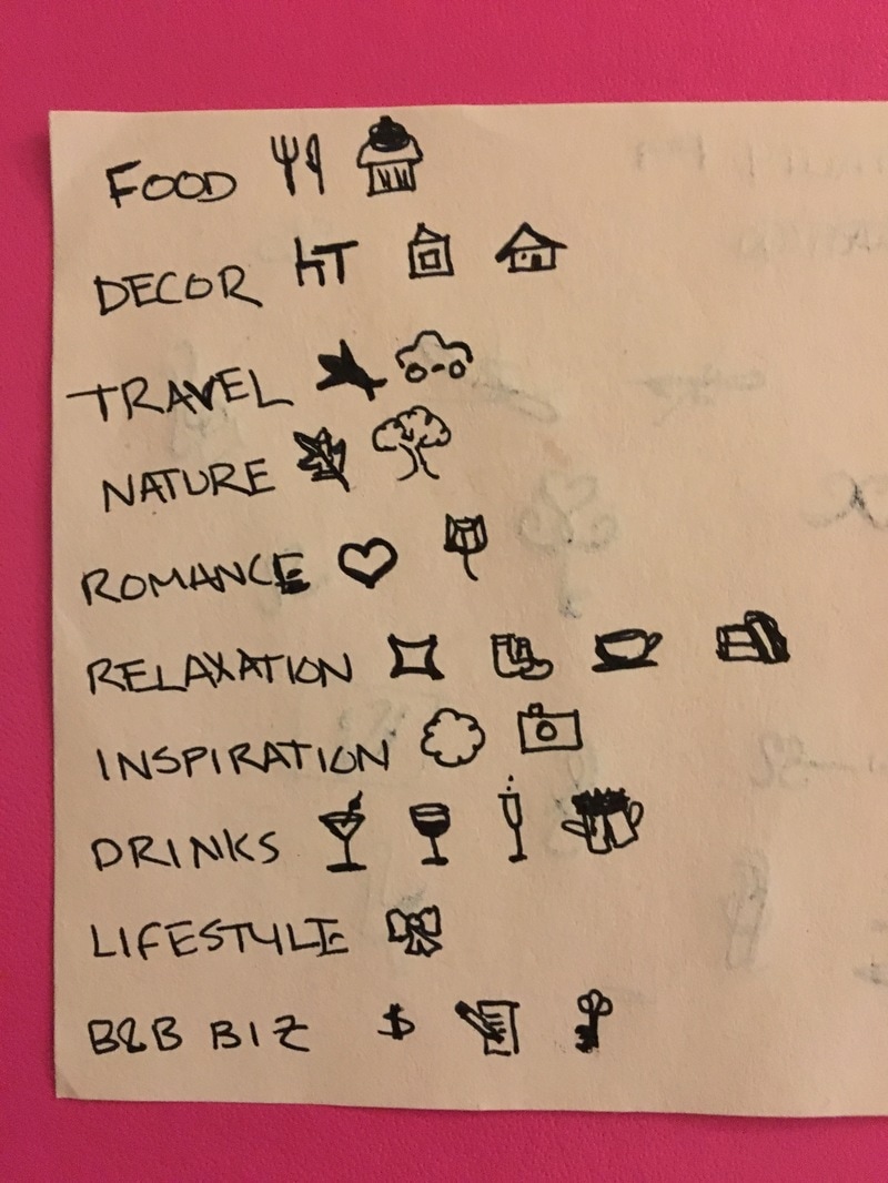
I don’t want to get too carried away with post types here. A lifestyle blog has the benefit of being a little bit fluid, when it comes to themes. I’m not necessarily stuck posting all food or all decor, but instead I can play around with things I love as they come up. However, there’s also a bit of a niche here - it’s a bed and breakfast inspired blog. So somehow, each post needs to relate back to b&b’s directly, or at least to that b&b lifestyle. So, I made a content web, where I wrote down everything that can fit into a bed and breakfast theme. I started, of course, with “Bed and Breakfast” in the middle, and then went out from there with a few major nodes: Decor, Food, Travel, Relaxation. Then, I broke those down into even smaller categories: Decor became bedrooms, details, themes. Food is comprised of breakfast, cocktails, fruit bakes. Relaxation can cover music, books, and romance. There were a few little topics I struggled with. Where do I fit in pets? Is that part of relaxation, or storytelling. Do I want to cover local travel topics, without even knowing where my future b&b might be? It’s a work in progress, and it always will be. Blogs live, and they evolve. And maybe today I’m not sure if I should be covering personal stories on their own, or fitting them in anecdotally to food posts. But in a few months it could be clear where each story should fall. 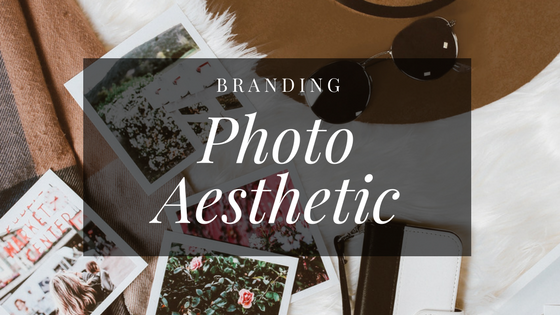 One thing I like to do when defining my brand photography is to pull as many images as possible that make me “feel” like they fit with my brand. It’s not really something I can easily define, but when I see images I usually just know right away if they are what I’m looking for or not. But then when I look at them later, there are always a few that don’t quite fit with the rest. Maybe they were stretches to begin with; maybe my mind starting going off on a tangent while pulling the initial photos - I’m not really sure. So this activity I like to do goes like this:
This is a great activity because it lets you step away from branding for a little bit, and get your mind fresh. Looking away, and then coming back the next day is a great way to see something you missed before. Also, I really like this activity, because it leaves you with a really solid set of photos that you can then use to compare any new ones. Once I’m done, I use these 20ish photos as my brand “core” and whenever I add a new one, I place it into the composite to be sure it doesn’t stand out. Let me know if you try this activity! Here’s my original composite of 27 photos (and next week, I’ll post the final twenty!): 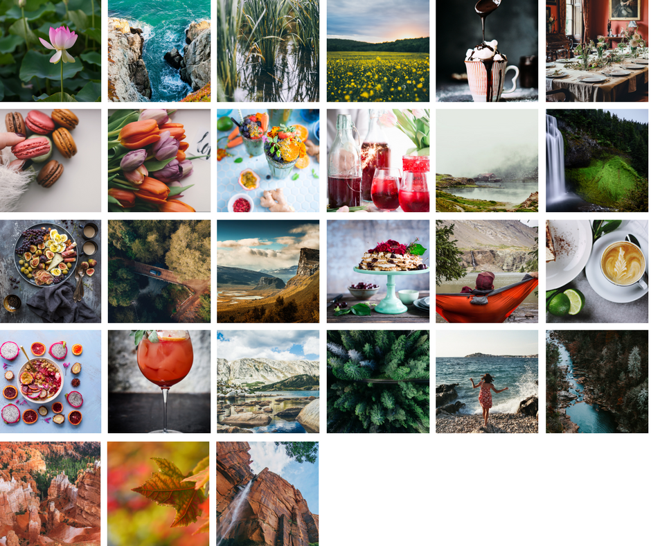 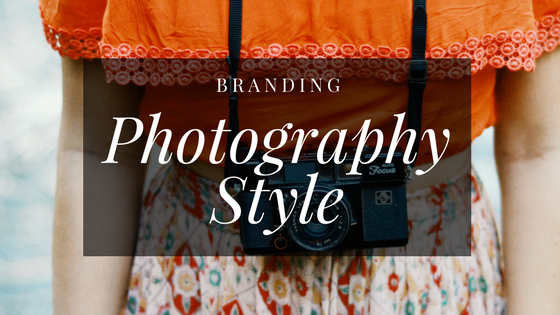 Taking a little break from design, today I was working on a different aspect of branding: my photography style. This is sort of what I specialize in: I have a background in photography and photographic storytelling. I love this stuff.
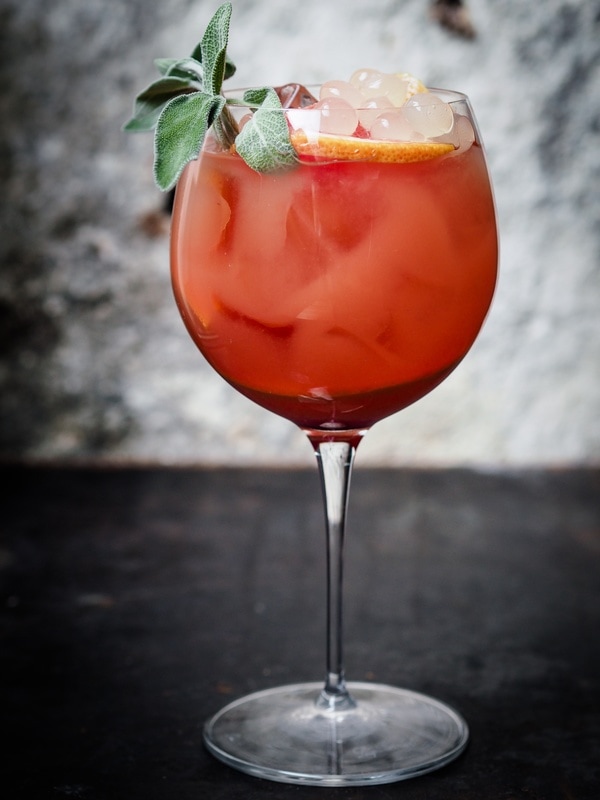
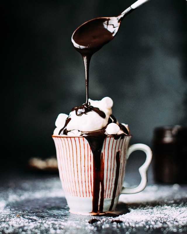
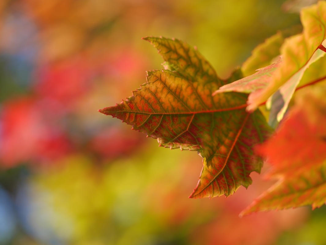
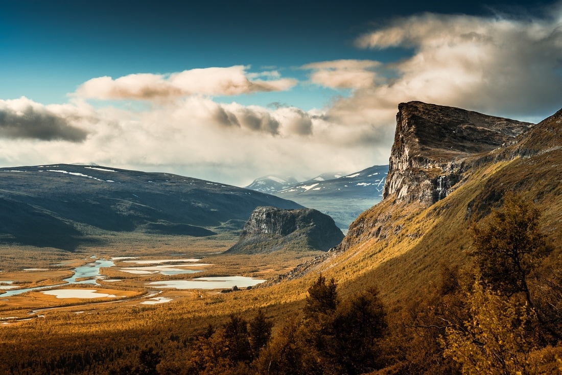
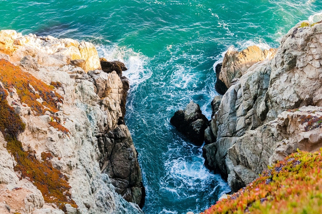
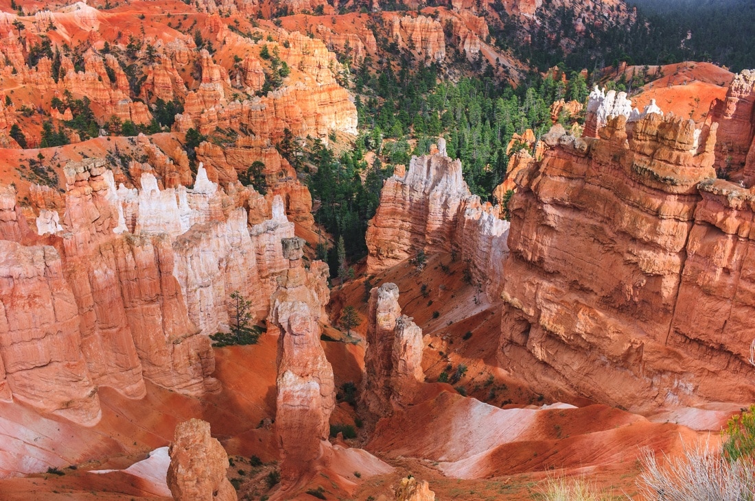
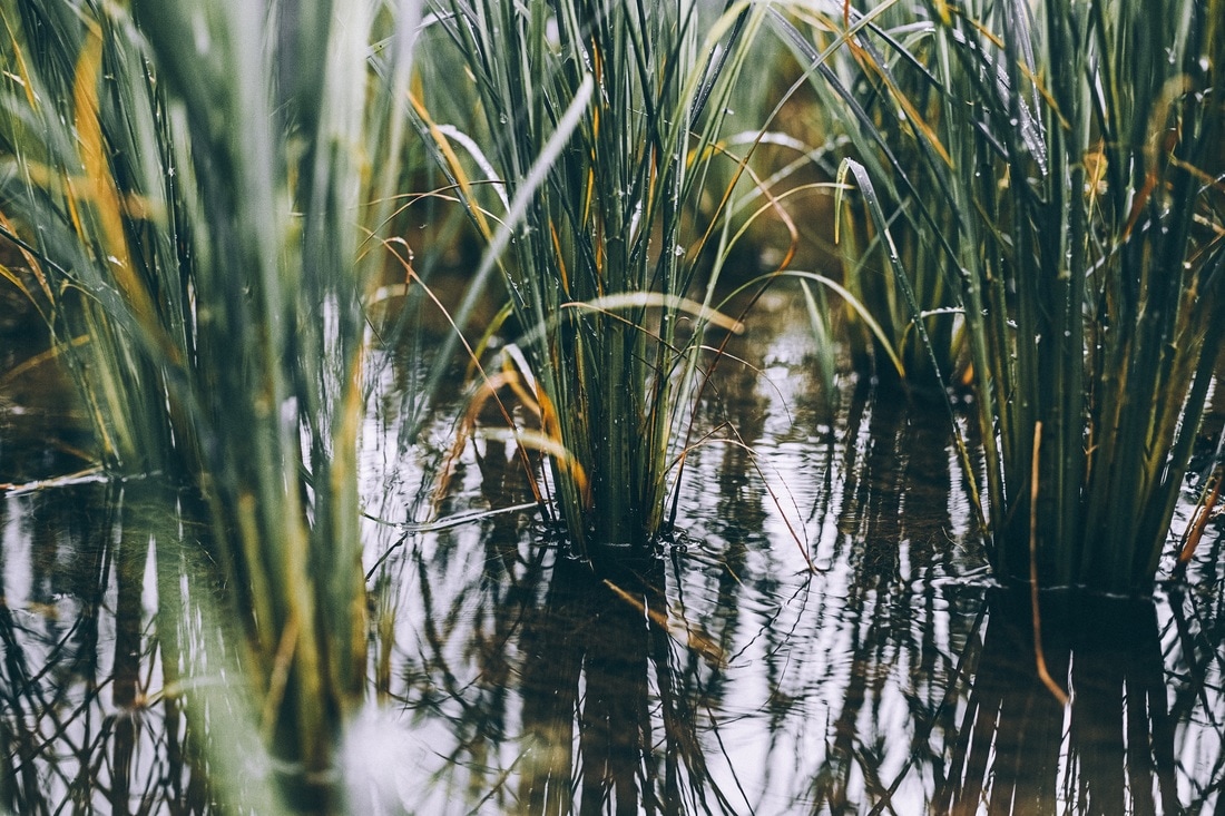
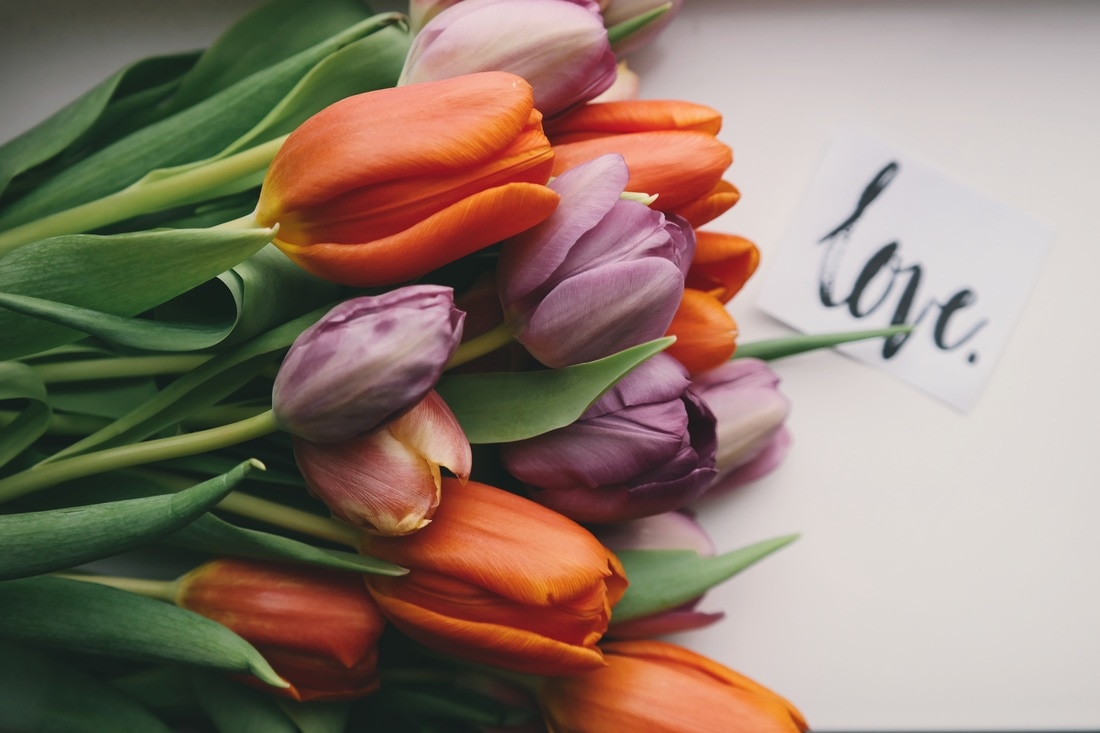
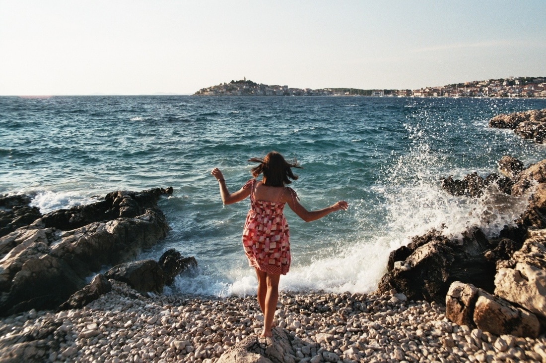
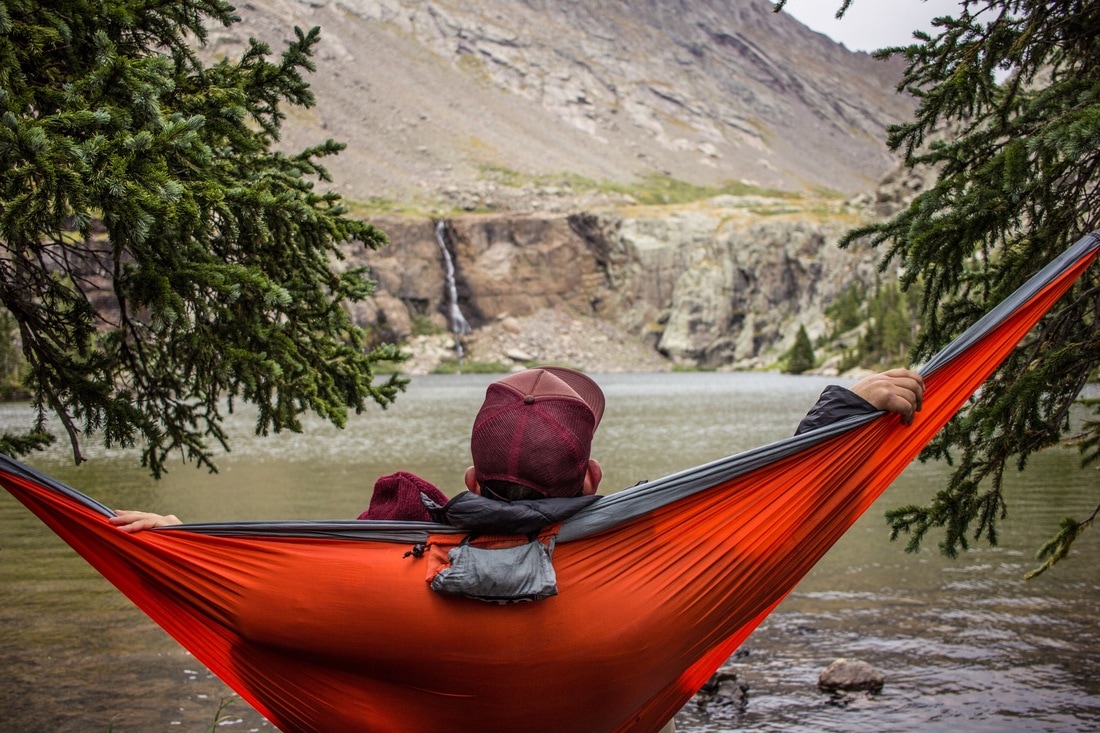
I like to think about three different things when it comes to brand photography: subject, style, and mood. Subject is what’s actually in the pictures - people, food, animals, abstract designs. Style is how it’s constructed compositionally, such as camera angles and layout. Mood is how it makes you feel, and can focus on color themes and lightning techniques. Each can range from extremely specific - such as women shot from behind at sunset with a warm, soft glow; to incredibly broad. The idea isn’t to create limitations, but to figure out what is necessary to keep my brand story accurate. So let’s gather some ideas, and then I’ll pull a few photos that inspire me. Building a photo library, to me, is extremely important, so I’ll probably have a few posts to show you how I will go about doing this to come! Subject
Style
Mood
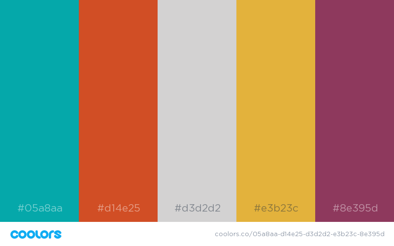
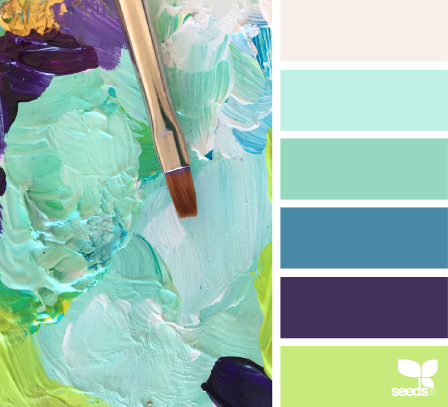
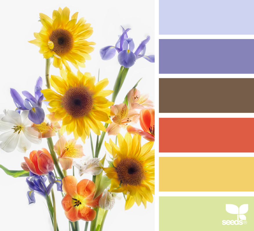
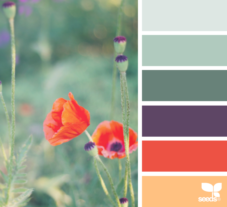
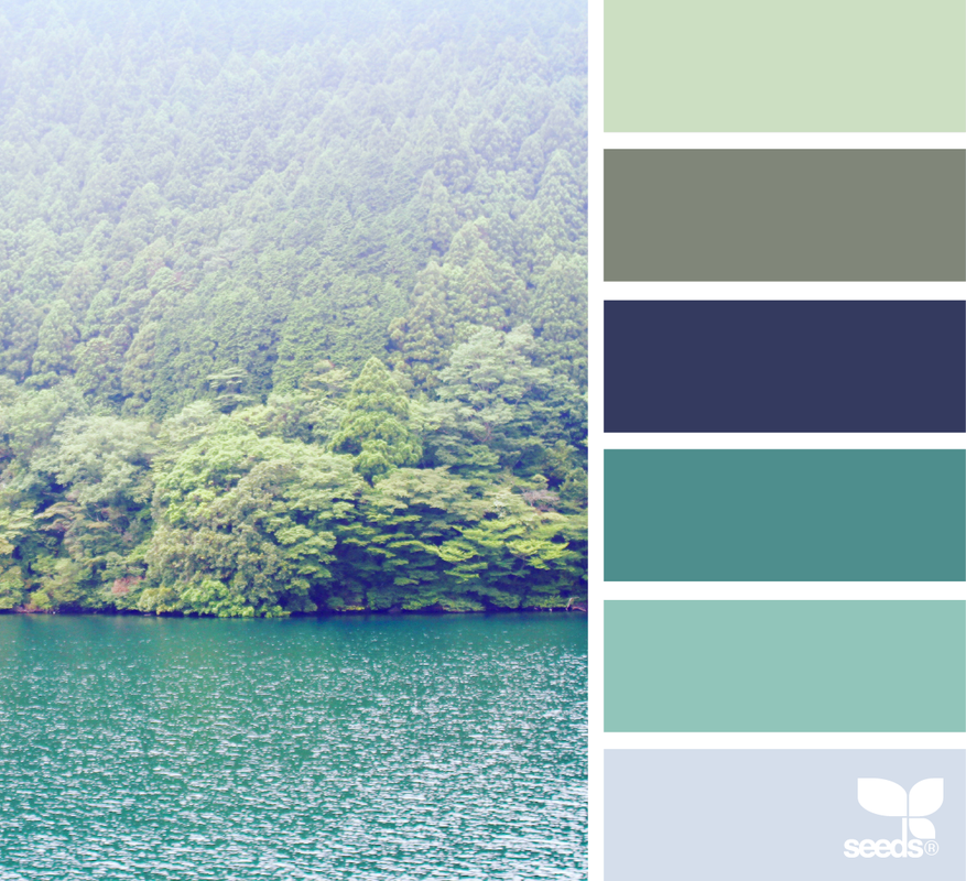
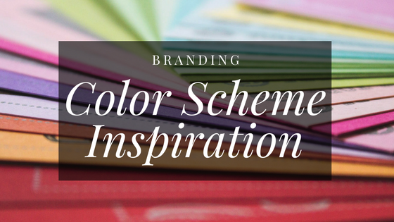 Color is, to me, the most important aspect of a brand. Colors speak to me in a unique way, and they each represent specific feelings. When I emote, my brain fills with color. In my last post, I defined my brand words, and that brought out some color concepts: Orange, teal, purple, cream, pale blue, rose gold, kelly green, navy, wood grain. This post is much less flourishing language, and a lot more visual. I searched through some color palettes on Design Seeds, and here are a few that I just love for this brand: Which one is your favorite?
 My personal website is hosted through Weebly. That’s where you are now, reading this post. But Weebly isn’t the greatest platform for a full out blog. It works well here, because this site includes a simple blog, photo galleries, and individual pages for projects I’m working on. But Slumber and Scones is way more blog focused. While it might have a few standalone pages (About, for examples), the blog is going to be the main content and draw. So I needed to start thinking about different platforms for hosting and building its new home. Tumblr I love Tumblr, but I don’t think it’s the right platform for what I’m trying to do. It’s more of a micro-blog and sharing site, for quick multimedia posts, and less for longform writing, which is much more my style. Blogger I have approximately 27 blogger blogs, and they are all acceptable. But none of them are really that great. I like the interface and platform, I like the ad integration. I don’t like the lack of freedom in design, and the blogspot address in my URL. SquareSpace Similar to Weebly, but a bit more into the blogging space, SquareSpace was definitely an option. I love the many template options, and SS hosts some gorgeous sites, but I ultimately decided against it because I prefer a more robust blog management system. Social Media Only I considered briefly doing a strictly microblog, using a combination of Instagram and Twitter for all my content. But I quickly decided this wasn’t the right direction for this blog. Using Instagram as a microblogging platform can work really well, but I wanted to have categories and tags, and a ways to link between posts I reference. It just wasn’t going to work. Wordpress I’ll admit I was nervous to look into Wordpress. It’s the most complex platform. I’d be so much more comfortable with an all in one, but I like the freedom that comes with Wordpress. I want the ability to make this blog into exactly what I envision, and this is really the only way to go for something like that. So there you have it, we’re going with Wordpress! |