|
When it comes to social graphics and templates, there are really three main places I want to focus: Twitter, Instagram, and Pinterest. Each has a few unique features I need to think about.
This should be a horizontal image, and needs to include the post title and possibly either category or subtitle. It doesn’t necessarily need a watermark or logo, but it might be good to include a small URL of the homepage. I need to think of a standard text overlay, and whether to keep it neutral or bring in brand colors. A whole different animal, Pinterest images are vertical, and normally include the most information. I’ll probably want to think about a standard header or footer, and possibly a “sticker” overlay for downloads. Long pins perform better, but I want my pins to be a lure, not include the entire post content. When it comes to Instagram, the question is whether to use text at all, or just allow the image to do the talking, and mention the blog post in the caption. I don’t like when text disrupts an Instagram feed full of gorgeous images. As the most visual format, I think having strong imagery is the most important factor here. Sounds like I have a few things to keep thinking about!
0 Comments
I had one Wordpress site in the past, back when I was running Girls Are Geeks (check it out for a throwback!), and we didn’t really focus too much on theme or designs, and since my personal site, A OhKait, is hosted on Weebly, I’m about as much of a beginner when it comes to Wordpress themes as is possible.
I have a couple ideas in my mind when it comes to the design of this blog, and these are the main factors I’ll be looking for in whatever theme I end up choosing:
Is it possible to get all of these things in a free theme? I guess I’ll find out! If you have any free theme suggestions, be sure to send them my way! I’ve decided on a font pair! The winner is: Here’s why: I really liked the idea of having a serif and a sans-serif font in my brand. I can use the sans-serif more heavily on the blog, and the serif sparingly. However, I have it in my arsenal if I ever decide to create printables or ebook-type downloads.
I decided to go with a serif that is nice enough to be a header but also works as a body copy if necessary for that same exact reason. My sans-serif, I just wanted something non-intrusive. I want the content to be more important to the reader than the font. I find that a lot of blogs have fancier fonts for their main content, and I just get distracted. I will use Open Sans in black for all my main post content. And then use Libre Baskerville in Grapefruit and Canopy for body headers, subheads, etc. What fonts do you use on your blog? Share them with me! I'd love to see some combos. Today, I’m looking at some photography editing styles, trying to figure out if I want to go for something more natural, or make use of overlays, gradients, and color alterations to come up with something a little more unique for the brand. This is an important step in branding, because a blog uses so much photography. If I commit to a photo treatment, it’s something I’ll need to add for every post header and social media image. Now, the extra work isn’t a good reason to not have a strong brand - so it’s still definitely something I’m considering. Plus with Lightroom presets, Photoshop actions, and templates, I can easily create processes that will allow me to batch and create gorgeous images with little effort. Here, I pulled three photos from my brand set and two I recently took, and played with a selection of Lightroom overlay ideas to see how I feel about them. Let’s take a look: Original Images: Overlay 1: Starting simple, this one brings an even light across the images, and slightly boosts the colors. It’s consistent, but subtle. Overlay 2: Jumping right to something super bold, this overlay overly boosts the vibrance and brings in a high-contrast drama Overlay 3: This one introduces colors through a gradient light-leak style overlay, which gives every image a feeling that they go together Overlay 4: For a softer look, this one brings the vibrance and colors down but carries a warmth from the sepia style desaturation Which one do you like the best?
I was thinking about weighing some hosting options, and listing out all the pros and cons. But it turns out that most of the newsletters I get targeted to bloggers pretty much all had the same recommendation: Blue Host.
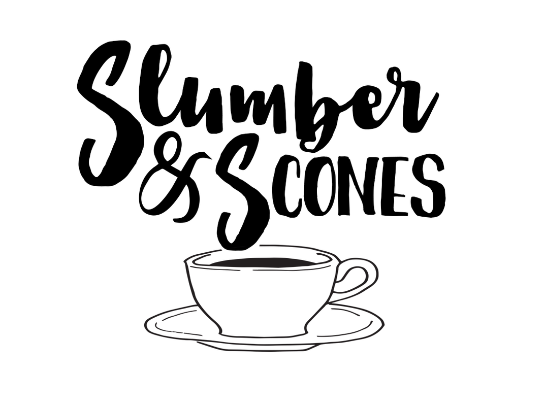
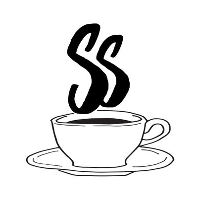
So instead of being my typical list-making, decision-fatigue self, I decided to just jump in and get started on this blog thing. Now that my branding is getting a little more nailed down, I need a playground to try out my font combinations, colors, and brand assets together. I am a visual person, and I can’t just imagine where my blog is going to live. So instead of waiting around until everything was perfect, I bought the land, and now I can work on designing the house. I’m pretty proud of myself for diving into this one. It’s a rare occurrence, after all. Check out slumberandscones.com, although it's not much right now! Here we go. Finally all the brainstorming, sketching, font selection, and more come together into creating a full out logo (with multiple versions to be used in different situations). A logo generally is the full lock-up of text and symbols, although some versions only include one or the other, or only include initials. So what did I decide? Well, I settled on the wordmark already, and the more I looked at those S's, the more I really liked the concept of the steam coming out of the coffee cup. I tweaked a vector coffee cup I downloaded from Creative Market, and played around with positioning until I came up with this full logo: Then I build out the rest of the versions: an initial mark, the initial with symbols, the wordmark (which I already had), and the horizontal wordmark: Next steps? Decide if that coffee cup is really right, and refine it. Then, think about whether or not - and how - to add color!
In designing my wordmark, I came up with a great combination of two feature fonts. These are useful for header, blog post banners, titles, signatures, buttons - really anything that can be an image, and is not a large block of text. However, now it’s time to think about body and header fonts. There are a few limitations here: I can’t just dig through my extensive font library. These need to be readable - the body copy especially in large blocks and at smaller sizes. The header font can be a little more flexible, but still shouldn’t be a fancy script.
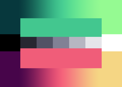
They also need to be available. With webkit fonts, I can install the font right into my website, but not all fonts have that option. So for this, I’m going to be mostly looking through Google fonts to see what’s usable. I’m using fontpair.co to visualize some ideas: When I played with the color scheme generators, it was to get a better idea of some of the main colors that could make up a full color scheme. A full brand needs more than five colors - it needs neutrals and shades and variants. So I took the scheme that spoke to me the most and refined it. Here's what I've come up with: The scheme includes two gradients, each including the main middle color as the dominant brand color, with the end points used for accents; and a series of neutrals. Of course, I had to name all the colors, so here they are:
So what do you think? How does this color scheme make you feel? I’m building on my content web, which is a bit nebulous, and not really a great organization tool. It’s time to get my butt in gear and start producing content. I want to have 35 posts written and ready to go at launch, and I want them to fit into a variety of categories. So I started a spreadsheet (of course… if you’ll learn anything about me, it’s that I love spreadsheets and use them for everything). Across the top, I listed potential large blog categories, and then underneath, smaller categories. It’s based on my web, so many of those ideas are identical. The idea here wasn’t to come up with new categories (although I did think of some), but more to better organize my thoughts into a usable system. A web is a great way to get ideas onto paper, but not the best way to reference them later. This is a good chance for you to see how I use Google Drive for basically everything. All my organization, post drafts, outlines, branding, etc. are house in Drive. In another post, I’ll explain that organization system!
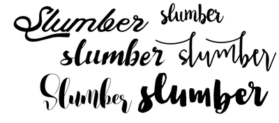
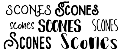
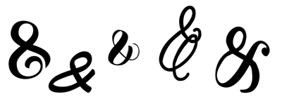
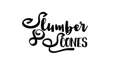
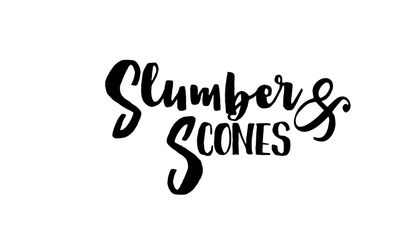
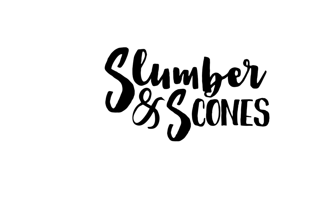
This could technically be considered two different steps of branding, but I do them together. Fonts outside of the context of the brand's wordmark just don't always work the same way. I need to see them within the wordmark to really get an idea of if they are fully communicating the concept I'm trying to portray. So here, I started thinking that I wanted the word "Slumber" to be a more scripty, feminine font, where the word "Scones" is a bit more whimsical and adventurous. But they both need to complement one another in the end. Also, I needed to consider including an ampersand as well. I started by pulling a few fonts I liked on an individual level. Note: I own approximately 1,000 fonts, so this was a fun adventure... Next, I put them together into a few combinations. It was obviously very quickly that two of the lowercase fonts worked better together than any others, so I was mostly experimenting with the capital S's and the ampersand. When I found one I liked enough, I tweaked it a bit into the final wordmark. And now it's time to combine that with some of the logo icon sketches I've been playing with to create a full logo!
|
